When developing models (components) for the 3D Warehouse, you should model for visualization, design, and specification. A great model is one that performs well as a component in the context of a larger project.
As you are working to create a component, you use tools and techniques to work quickly in SketchUp, including the use of sub-components, which might be mirrored or arrayed, scenes, sections, and layers. These techniques enable you to model efficiently, and they can help you to anticipate future changes to the product model.
Remember that designers out there simply want to use the objects that you publish to 3D Warehouse. These guidelines are designed to help you take into account those things that will ultimately help facilitate the use of your product models by designers.
This is a checklist to help you provide great models to users of 3D Warehouse. A great product model should conform to the following checklist items:
- Be at real-world size
- Use a common sense axes origin
- Orient faces properly
- Minimize geometry to represent the item
- Minimize material image sizes
- Embed useful metadata
- Restructure for 3D Warehouse content
- Purge unused layers, components and materials (Model Info > Purge unused)
- Use one layer: Layer0 (or minimal layers)
- Use a simple consistent style
- Avoid stray geometry
- Avoid section planes
- Avoid guides
- Use only appropriate text and dimensions
- Choose only appropriate geolocation
- Test for correct behavior
Manage the model-creation process
When you work within a ‘working’ file that contains one or more of your product components inside the file. This allows you to benefit from the use of scenes, section planes, layers, and construction geometry during modeling. After your product component is complete, use Save As to send the finished component(s) out to a library folder of Component Files, for you to upload individually or in bulk to 3D Warehouse. From there your product model will be used by designers who download the model from 3D Warehouse.
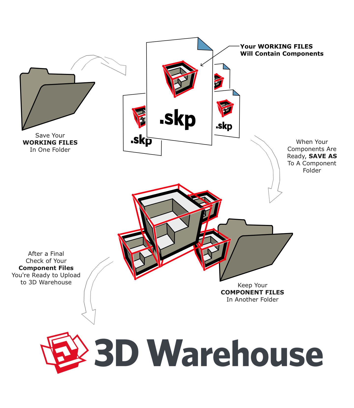
Your Working folder should contain your Working files which contain your product components as you build them. Your Component folder should contain your finished Component files for upload.
This working file process moves a component from development to 3D Warehouse-ready cleanup. You will restructure the component from a “modeling object” to a 3D Warehouse “content object”. The checklist is structured to complement this process, helping communication in the review process. Retaining the working file allows you to save your original product component for possible future revisions, which can again be efficiently re-uploaded to 3D Warehouse.
The final step before uploading to 3D Warehouse is to always test your component to see whether your component behaves as you expect when imported into a design. Ask: does your component help or hinder a designer’s workflow?
When you are ready to upload your component to 3D Warehouse, perform a check of items 1 thru 6 in your Working file. Then orient your model to view the component as you want it shown in its thumbnail view in 3D Warehouse. Right click [context click]* on the component on the modeling screen, and select Save As to the Library folder that will contain all of your Component files assigning the filename you want to use for each file that will be published to 3D Warehouse. Then open the Component file from the Component folder and finish the checklist. * [ ] indicates Mac syntax throughout this article.
The following article explains each checklist item in more depth.
Be real-world size
The main attraction to use 3D Warehouse manufacturer product components is to save designers time in determining which object they want to use in their design. So, it needs to answer the question, will it fit in the space they are designing?
Products should be modeled to real-world actual size, whether using metric or imperial units. This allows things drawn in either unit systems to coexist in one model.
If a component is the wrong size, you can use the Tape Measure tool to fix this. Edit the component, measure a known edge, and type the correct distance value... And, , it is fixed! If you use the Tape Measure tool to scale method, be aware that only raw geometry (faces and edges) get changed. All sub-components in the main component get re-scaled and re-positioned, not changed. They retain their original definition scale. It is best practice to right [context] click on each sub-component and select Scale definition to redefine each sub-component’s “native” size for future use.
Use a common sense axes origin
By default, SketchUp uses the lower left corner of the selection bounding box to set the component’s axes origin. This default point may not be the best in all cases. The axes origin is shown in SketchUp as red, green, and blue lines intersecting at their “origin”.
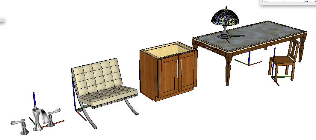
The axes origin serves two purposes in SketchUp. Firstly, it is the point by which a designer will place the component when they download it from 3D Warehouse, or their component browser. For products installed at a specific point, consider using that point. For example, lamps would use their center line at their base, faucets would use the center of flow line at their base midpoint.
Secondly, it is the point around which the component will change if it is reloaded at a later time. Think of this as the place from which the component will shrink or grow when Replaced or Reloaded. For example, toilets and urinals might use a point on the back wall, at their base, so that they will grow outward from the wall if they are replaced by another fixture. Cabinetry should use an insertion point on their “back wall” also, but for these, the back left corner might be better, so they grow or shrink in a single direction if they are replaced by another cabinet.
Tables and free standing objects should use their center of mass at their base or ground plane. For chairs it might be better to use the center of their “front” at their base, allowing them to grow outward from the table or desk if they are swapped for another chair.
To summarize, choose a point that is on the ‘ground plane’ of the object, and one that corresponds to a governing point in the object (for example, a center point, a common field installation point, a reference point, etc). Make sure that placement will feel intuitive to a user.
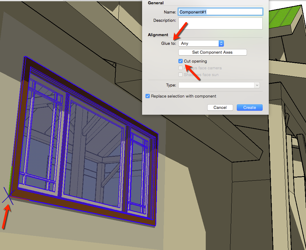
As part of the alignment definition, components in SketchUp can automatically align to a surface and even cut holes in a surface. Windows and doors are good examples as these can be gluing components. When creating a component, if there is a closed loop of coplanar edges in the selection set, that closed loop will act as a ‘suction cup’ that tells the component to glue to a surface during future placement of the component. The axes will be shown as a red and green line with a blue X where they meet. This means that the blue direction is locked to a surface when the component is placed.
As mentioned previously, we recommend you work in a master file within which you select geometry to make components (and then use ‘Save As’ to write out the final component files). Be aware that this method can create gluing components if the stuff you select is modeled on a surface.
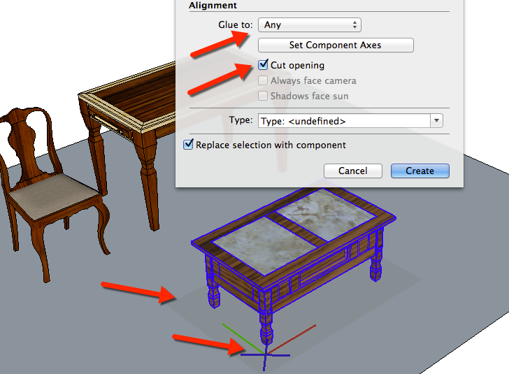
The following example shows how to insure that a table is not inadvertently created as a gluing component. In this example, the legs are made up of faces and edges, not components. Thus each leg base has a closed loop of edges that touch a surface (the ground plane). When the table is selected, and then Right click > Make Component is selected, there are four hints to indicate to you that this table will be a gluing component.
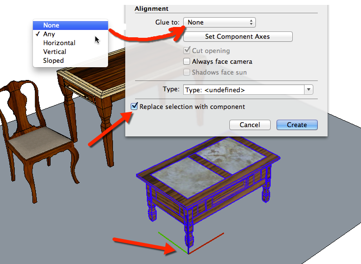
- The dialog shows Glue to: as Any
- The Cut opening box is checked
- There is a gray translucent rectangle shown below the component indicating the alignment plane.
- The Axes of the selection shows a blue ‘X’ meaning that the Blue direction is locked to the plane for the component. It will not be able to be moved in its blue direction off its red-green placement plane.
To correct this, select the Glue to: drop down and select None. Also make sure that the check box for Replace selection with component is checked. Notice that the selection Axes indicator changes to show a full red-green-blue axes, and no gray plane.
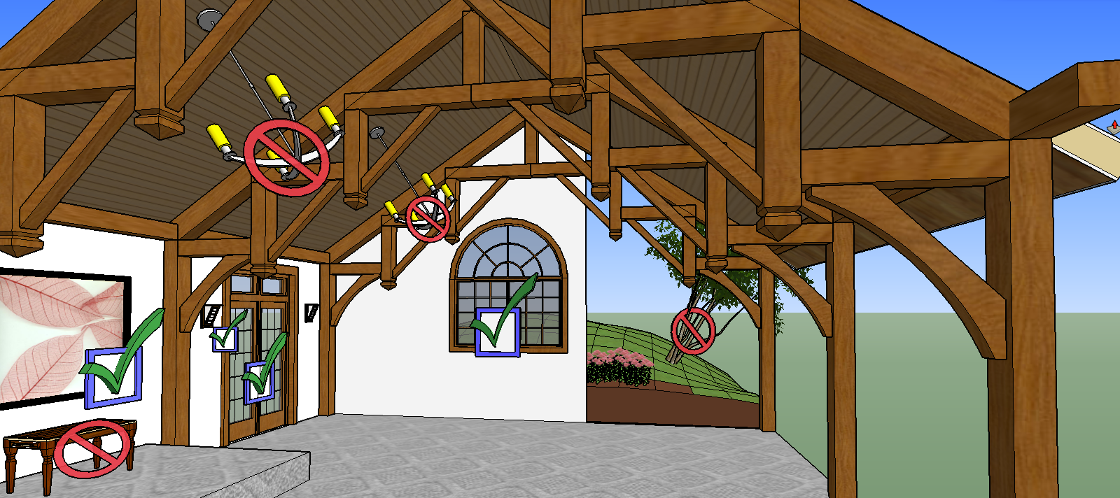
Yes, technically furniture always sits on the floor. But in design use, things are often moved between floors. . If the furniture is glued to a floor, it cannot be moved to another floor directly.
Plants and trees grow vertically, not perpendicular to the ground. Hanging ceiling light fixtures do not glue well because they will align perpendicular to cathedral (sloped) ceilings. The illustration shows that items on walls work well as gluing components: doors, windows, wall sconces, pictures, etc. Horizontal items like furniture require careful consideration. In general, things that cut holes when placed should be gluing (windows and doors).
Orient faces properly
Make all surfaces face consistently outwards and inwards.
SketchUp faces have a ‘front’ face color (white) and a ‘back’ face color (blue) This represents the inside and outside orientation of faces. It is best practice to orient all faces so that the ‘front’ face color is oriented outward, and the back face color is inward. This ensures that paint will apply to the object in a consistent manner.
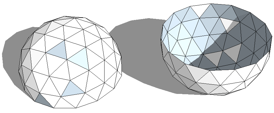
Faces in SketchUp can accept either the same color on both sides, or a different color on each side. Having inconsistent orientation of faces can cause gaps in the color across several faces.
Also, consistent face orientation is especially important for rendering, since it plays well with photorealistic rendering software. >
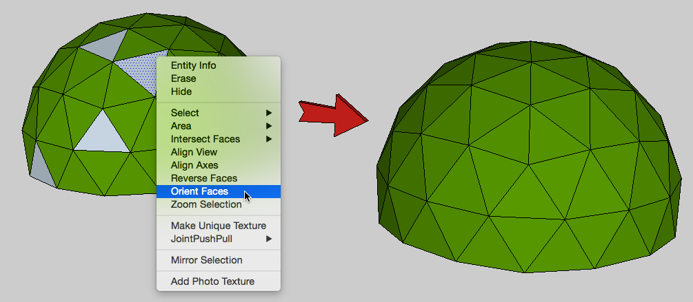
When you have a series of adjacent faces, you can right [context] click on a correctly oriented face and select Orient Faces to set them right.
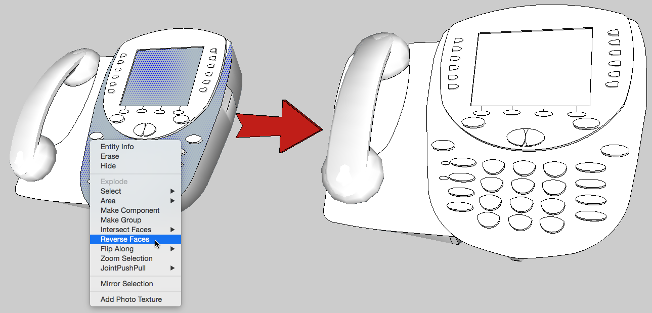
When you have faces that are not adjacent, you can select the faces, then right [context] click on one of the selected and choose Reverse Faces to correct them.
SketchUp allows you to build a complex surface made from adjacent faces all connected, appearing as “one” surface. This is accomplished by “softening” the shared edges between the adjacent faces, merging them into a complex surface. Often times, these types of surfaces are set to render “smooth”, appearing rounded between its individual faces. Using the Select tool on a complex surface selects the entire surface, it is all or nothing. 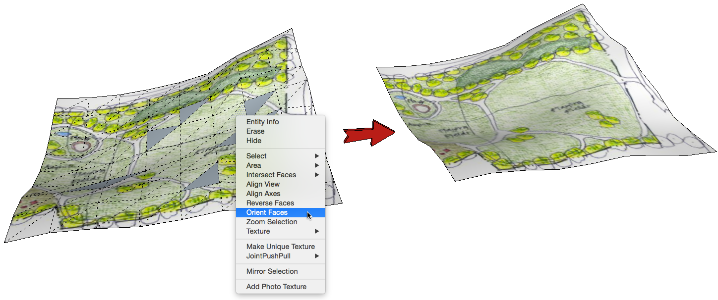 To select an individual surface within a complex surface, you must turn on Hidden geometry View > Hidden Geometry to show the individual surfaces.
To correct a complex set of interconnected faces, select a correctly oriented face and Right click > Orient Faces. If SketchUp does not orient the faces the way you wish, you can always orient them manually. Just select the incorrect faces and Right click > Reverse Faces to correct selected faces.
Minimize geometry to represent the item
Keep your polygon count to a minimum to represent the dimensions of the object accurately. Every face adds to the file size of the model.
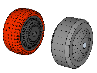
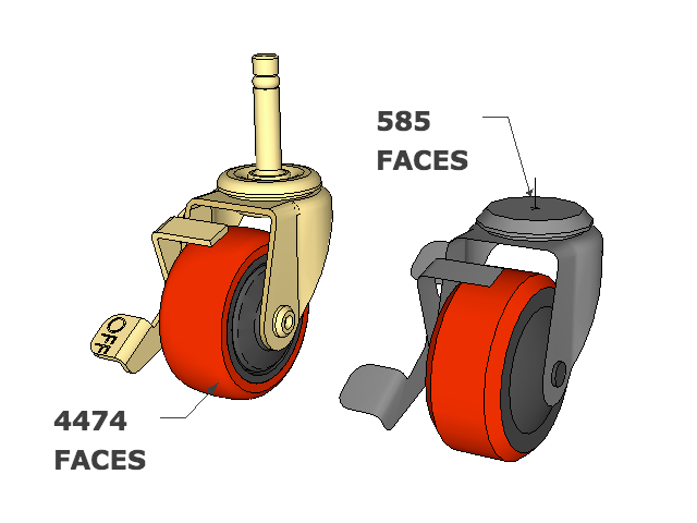
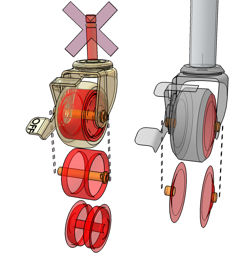
The place where you can conserve file size the quickest is to keep arc and circle segmentation to an acceptable minimum. This segmentation will govern the number of faces created by a Follow Me operation along a path or around an edge.
The second best way to limit file size it to model only what the user will see. That is, don’t model interior parts of a component that will never be needed by the average user. Remember, users only want your product as part of their overall design.
Here, the red and orange items within the hub of the caster can be left out of the model since they will not be seen when placing a caster. When this caster is included in another component, say a cart, the decreased polygon count makes the cart much easier for a designer to use. In other words, model just the outer shell of the object when possible.
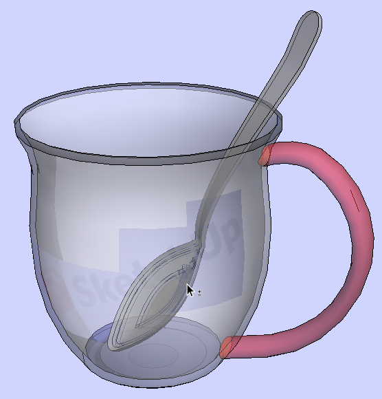
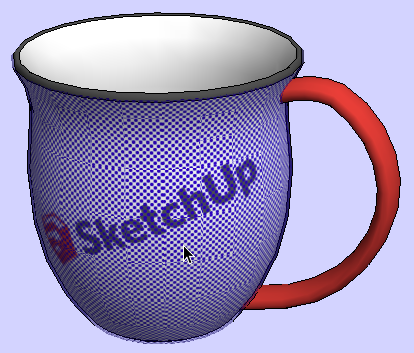
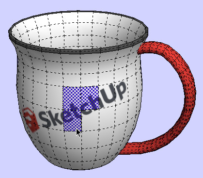
There are two display methods that will help when simplifying an existing model, or generating new geometry, X-ray mode and display Hidden geometry. View > Face Style > X-ray mode helps you see inside and through a model. Edges may be Selected through surfaces when in X-ray mode. The Erase tool works on edges through surfaces as well in X-ray.
Smooth surfaces act as one continuous form. The Select tool picks all the interconnected surfaces as one, it is all or nothing. To work with parts of a smooth surface, go to View > Hidden Geometry to be able to see where the face boundaries are. This will allow you to select just a portion of a smooth surface.
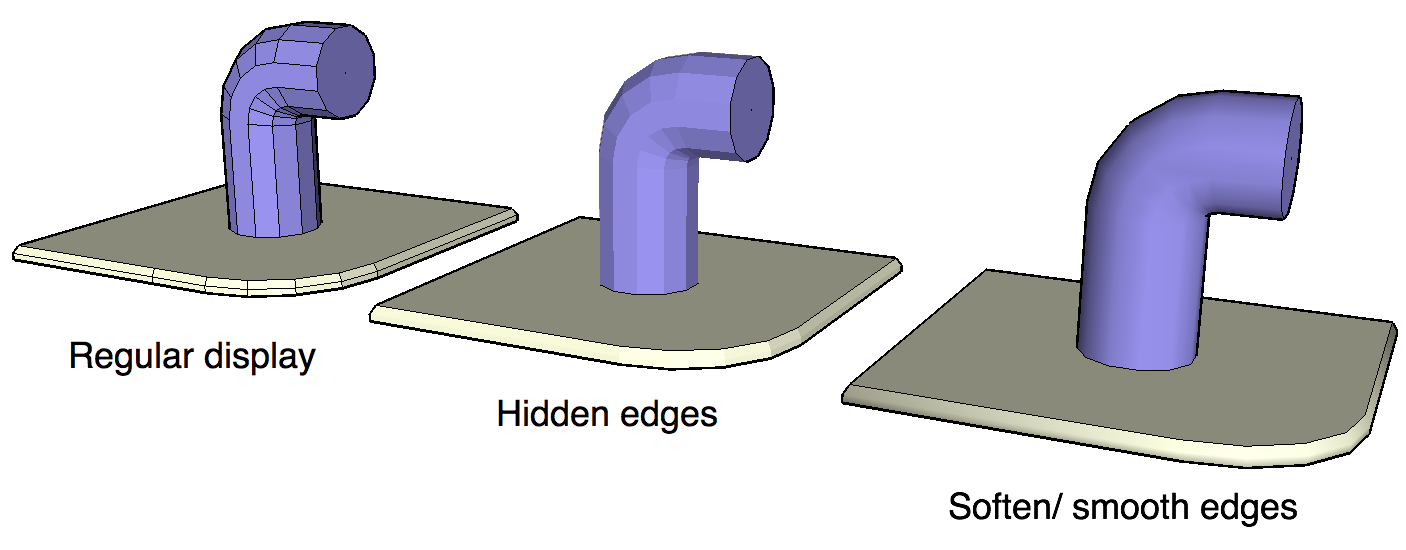
Some modelers use a shortcut to make a complex model appear more simple by turning off the display of edges in the style or hiding the edges. The problem is two fold, the end user will probably be turning edges back on, and more importantly there are still too many edges. Hiding edges does not simplify the geometry, the edges are still there.
Hiding edges can sometimes make a model look better. But rather than relying on hiding or turning off edges, you should employ the use of smooth surfaces. Using softened and smoothed edges gives a better appearance. Softened edges are rendered hidden, and smooth edges treat the surface as one continuous form. A smoothed model provides the look you want, even with fewer polygons. The smoothing gives the rounding effect without adding more polygons.
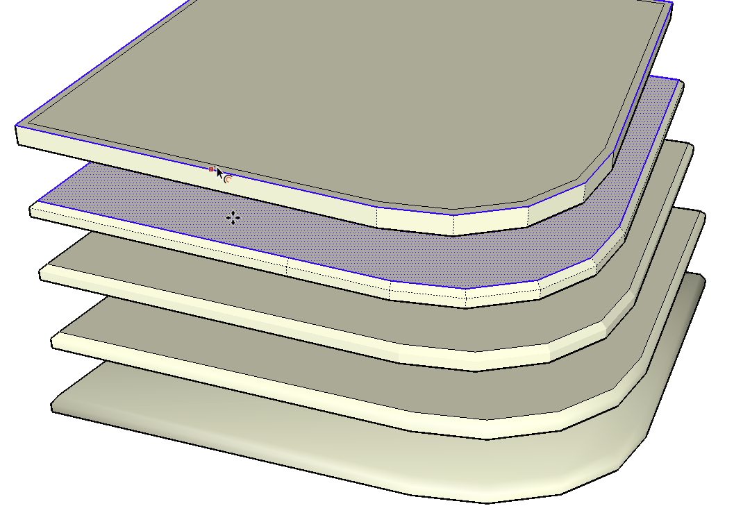
Eased edges can be effectively created by simply Offsetting an edge and then use autofold with the Move tool to create a chamfered edge containing minimal polygons. Then Hide or Soften/Smooth the edge lines and you are left with a soft looking edge without having to round off the edge with lots of tiny faces.
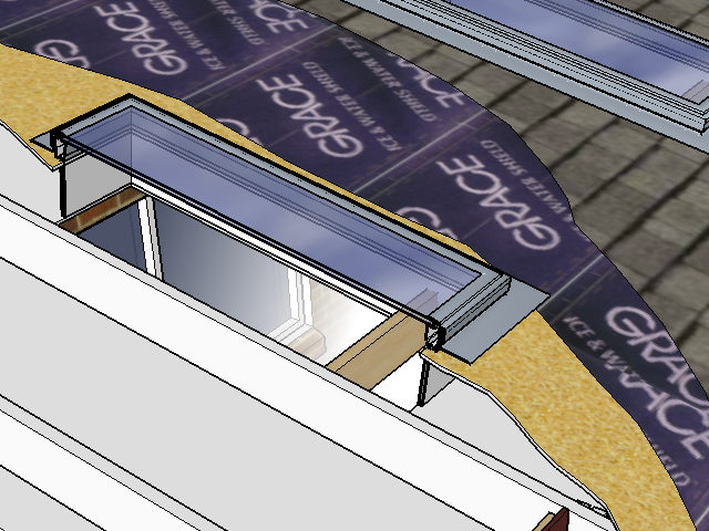
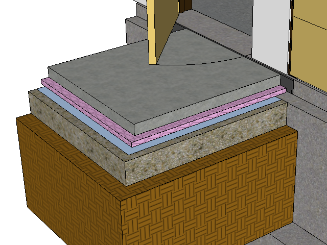
Surfaces with thickness can often be represented as a simple plane without compromising the integrity of the model. Just subdivide a surface with edges, and then paint each part of the “surface” with successive materials to give the model a layered effect.
SketchUp does not require that layered materials each have a complete six sided solid volume. Successive Push/Pull operations can represent this quite well with no actual slab volumes modeled.
Minimize material image sizes
Use lower resolution photos and images in your 3D Warehouse components. Textures and images are saved within the SketchUp file. Since these are raster files, they have varying degrees of pixel density, and as such, can greatly affect file size. Purge any unused colors and materials from your model. In SketchUp on Windows, materials that are used (referenced) to geometry are shown with a white triangle in the color swatch of the Materials Browser.
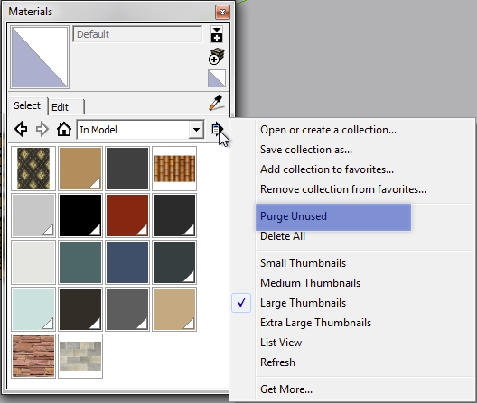
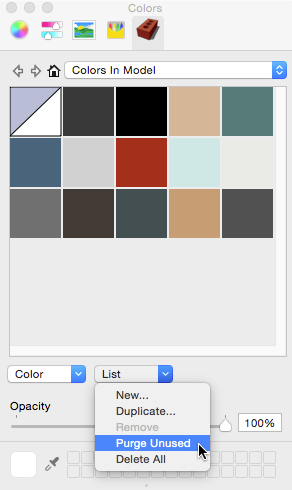
To remove unreferenced materials from your model, on Windows use Purge Unused from the Details button on the Materials Browser. On the Mac, use Purge Unused from the List dropdown in the Materials dialog box.
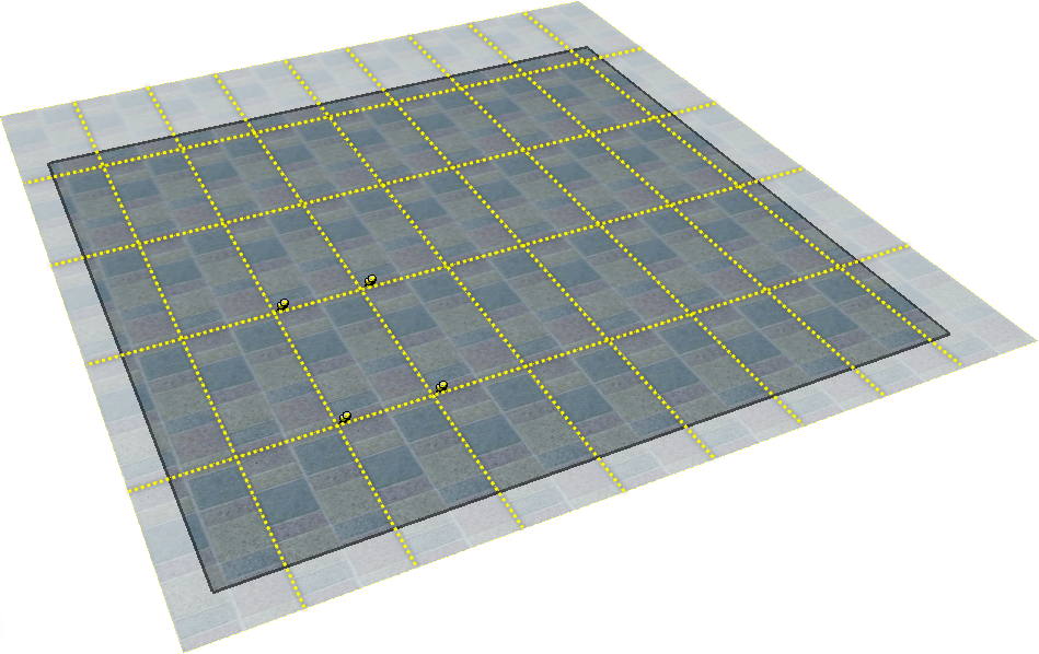
Use an appropriate level of detail in your image textures. All textures in SketchUp are tiled (repeated in a uniform way).
This means that the original image density does not have to be large enough to cover or stretch over a large surface. It will be tiled and cover the entire surface for you.
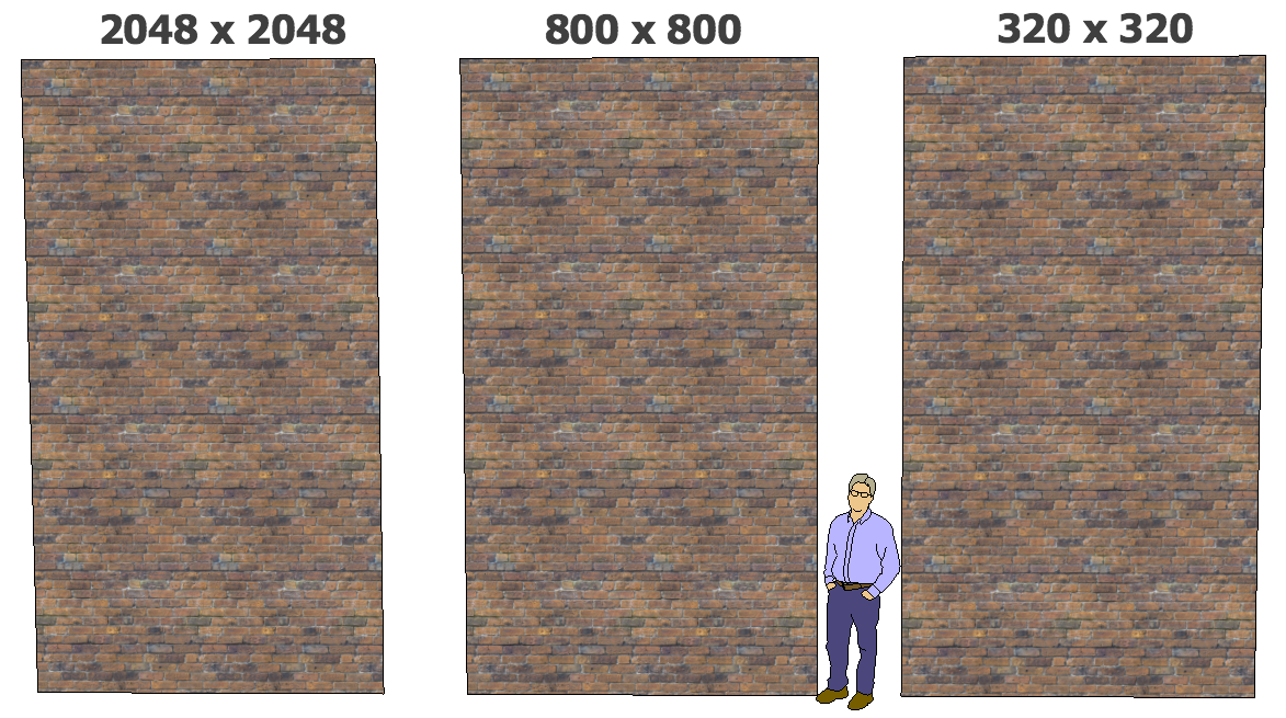
Pixel density should be limited so that the texture in SketchUp is not grainy or blurry for the scale at which it will be tiled. The brick material shown here using a 320 x 320 pixel tile (176K) is visually the same as the much higher resolution of 2048 x 2048 (2.4Mb). The higher resolution texture increases the model file size by 2.2Mb with minimal benefit. For detailed areas, 800 x 600 is usually more than adequate for building product models, whereas most models can use 320 x 240 or less.
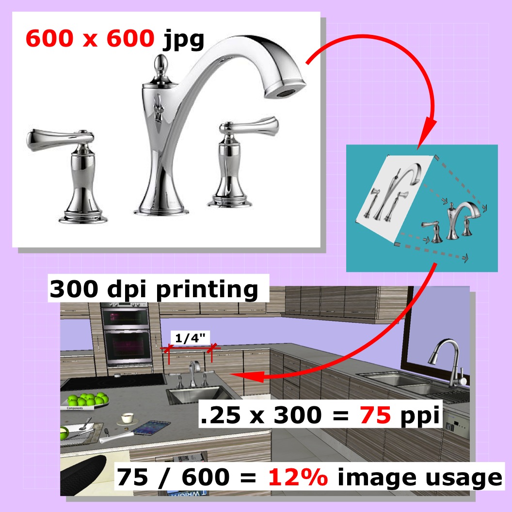
For example, if we want to show a faucet as part of a typical kitchen counter scene, the original 600 x 600 pixel texture will be applied to a faucet, then that faucet is placed on a countertop with cabinets and windows placed around it. The scene is intended to be printed out at 8-½ by 11 inches.
The actual printed size of the faucet on the paper will be perhaps 1/4 inch. This means that at 300 dpi resolution, the faucet will need to be at .25 x 300 = 75 pixels. So the original 600 dpi texture is only 12% utilized (75 / 600 = 0.125).
A smaller photo texture goes a long way.
To edit texture images in SketchUp, you must first make sure you have a raster editor program set up to work with SketchUp. Go to Window > Preferences > Applications browse to the application you want to use for editing image files [Sketchup > Preferences > Applications on the Mac].
To simplify a texture, select the Texture Swatch in the Material Browser [Color picker > Brick on the Mac] select the Edit tab on Windows [Color > Edit on the Mac] and select the Edit Texture button. After down sampling the texture, you must save it, then exit the application. The texture is updated in the model.
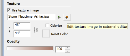
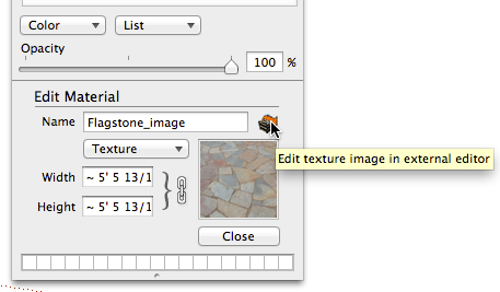
Alternatively, you can down sample a raster texture file using editing software on your computer, then Reload the texture file back into your SketchUp material from the swatch in the material browser.
Smooth surfaces act as one continuous form. The Select tool picks all the interconnected surfaces as one. So too with the Paint Bucket tool, it is all or nothing. To work with parts of a smooth surface, go to View > Hidden Geometry to be able to see where the face boundaries are. This will allow you to select just a portion of a smooth surface.
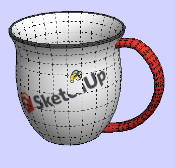
This is especially useful for painting a 2D image across a cylindrical surface. On the surface, Right-click [context click] > Texture > Position, and size and orient the texture properly. Then sample that texture and paint it onto each adjacent surface around the cylindrical shape, and the texture will wrap around the form.

To paint a general texture or image upon an undulating surface, often times it is adequate to simply turn the texture into a projected texture. On the surface, Right-click [context click] > Texture > Projected. Then sample that texture and paint it onto the entire surface as a whole.
Use high resolution images (1024x or 2000x byte files) only for trace over image modeling. This is because the image will not be tiled over the surfaces, but rather will be stretched to cover the model geometry. Refer to the Knowledge Center for how to Model from a Photo.
Embed useful metadata
Attributes or metadata can be assigned to SketchUp geometry and components. This is great for tracking product information. You can move data into and extract data out of a SketchUp model using metadata. By going to File > Generate report you can extract information on the entire model, or on selected items.
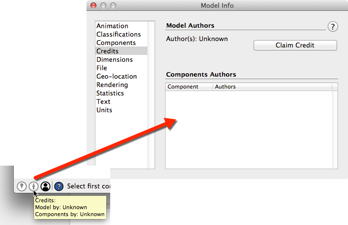
The Author (modeler) can digitally sign the model, thus giving credit to the creator when the model is used in other people’s designs. Here is a perfect place for the Manufacturer’s name. Go to Window > Model Info > Credits or click on the middle button at the lower left of the drawing model window.
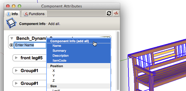
Currently, the easiest way to include meta data is to apply it using the Dynamic Component interface. SketchUp offers four basic attributes, Name, Summary, Description, and Item Code. Right-click [context click] > Dynamic Components > Component Attributes and select Add Attribute and select Component Info (add all). Then fill out the boxes.
The topic of metadata is a huge one, and is outside the scope of this checklist article. Adding attribute data to your models can be extremely useful for designers who are looking to design with and specify your products. Keep in mind that when your product data changes, you'll have to make any necessary updates to your SketchUp components and re-upload them to 3D Warehouse. If certain product data is likely to change on a regular basis, you might consider adding a link in the description that points users to where they can find the current information.

A simple system might start with just a unique id (SKU), a product name, and a URL for more information. It is important to remember, a model is a fixed, graphical representation. It should carry product information that is fairly static, ie. model number, size, power. Use a web link to represent highly variable information, or things that changes over time such as price, availability, color, specifications. Only model what you want to have to change later. It is far easier to manipulate metadata in a spreadsheet environment outside the model, than as a text field buried in a dynamic component.
You can also include your own Custom fields for other categories, such as LEED info, local sourcing, and even region specific info (for example with plant materials).
The important thing to remember is that you should strongly consider adding as much useful information as possible to your product models as you can support, for the sake of the designers who will be using your products.
At this point in the review process, you should Right-click [context click] on the component, and Save As to a Component upload folder. Then open your Component in the upload folder, and continue reviewing your Component with the checklist.
Restructure for 3D Warehouse content
Restructure here refers to components and component nesting. Think in terms of the number of clicks to edit into a component to change a sub component's color or orientation, or to manipulate it. You should minimize this number of clicks for the user of 3D Warehouse content.
There are four main things to consider when considering the restructuring or your component:
- Put sub-components and groups at the upper level of the outer wrapper, thus making it easy for the designer to manipulate them (color or orientation) immediately after editing the component or group. In general, build your model to facilitate end user editing using your option and color methodologies.
- Use descriptive names for all sub components and groups that users of your content will need to interact with.
- Things that are a set color or material from the manufacturer should be painted within the component and inner components. This allows you to orient textures to individual faces within the component and sub-components.
- Sometimes you may want to explode mirrored assemblies within the main wrapper, thus exposing the sub-components to the upper level of the main wrapper. The end user does not know your mirroring rationale, and if it is complicated, you might consider this simplification for the end user.
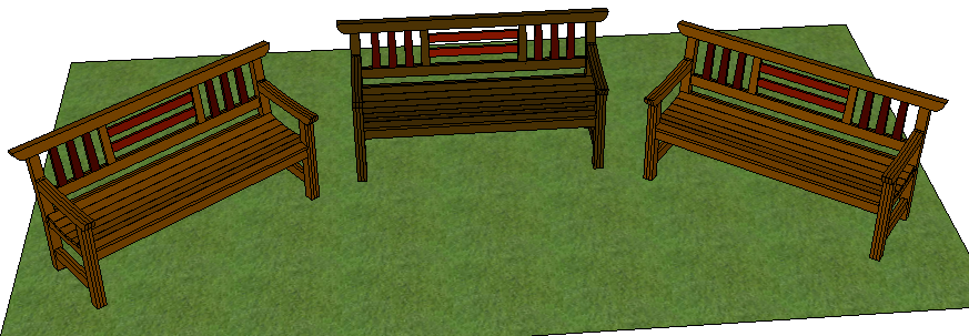
In the bench example shown here, the left hand image shows a ‘working model’. The component is structured to take advantage of mirrored halves of the bench. A change to one happens to the other. The brown slats are another group for modeling, and the yellow slats are simple independent components.
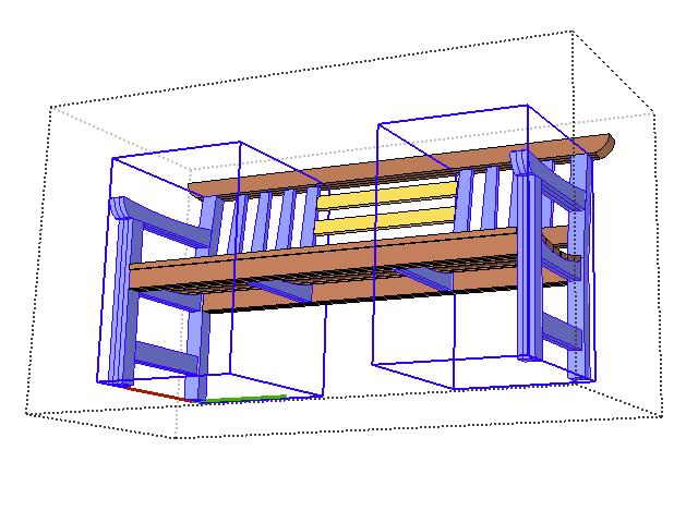
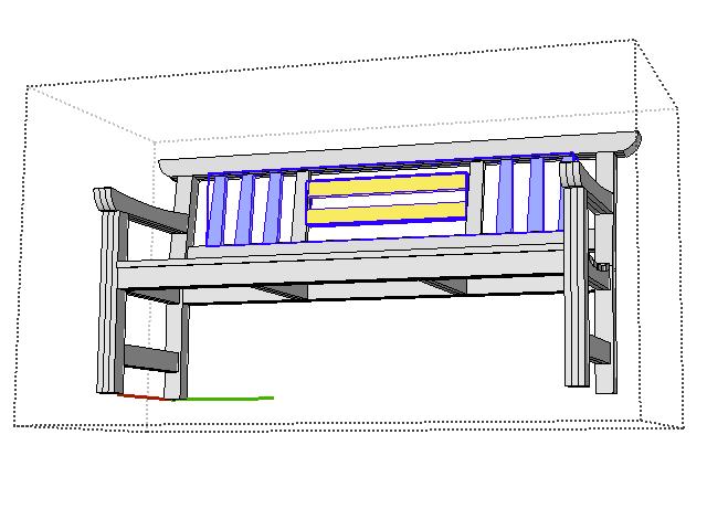
The right hand image represents an ‘upload-ready' component for the 3D Warehouse. It has been restructured. All objects are groups or components. All white objects are the default color and will become the color painted on the bench. The back slats have been organized to allow a designer to quickly paint them with accent colors. They are at the upper level of the outer bench wrapper, so they can be selected or painted immediately upon component editing.
 Working with geometry from CAD files
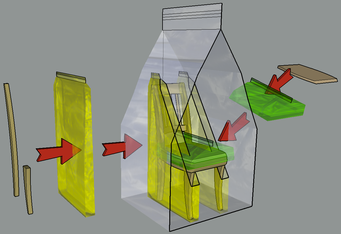
Components and groups can be understood as ‘containers’ or ‘wrappers’ that organize and hold geometry. Components and groups in SketchUp may be nested within other components and groups. The outermost level of a component is sometimes referred to as the ‘outer wrapper’. In this example of a chair, the legs are put into a component, then mirrored as a copy. The seat is put into a group. Then all the geometry including the back of the chair is put into an overall component named chair. This is component nesting, one wrapper inside another.
Many types of content require multiple levels of component nesting while developing the component, especially for manufacturing. But these are not needed by an end user of a component. It is best practice to simplify this nesting prior to sending the content to 3D Warehouse. It is important to remember that the designer using your 3D Warehouse content does not want to manufacture your product, they want to use your product (place, rotate, paint) in a larger model.
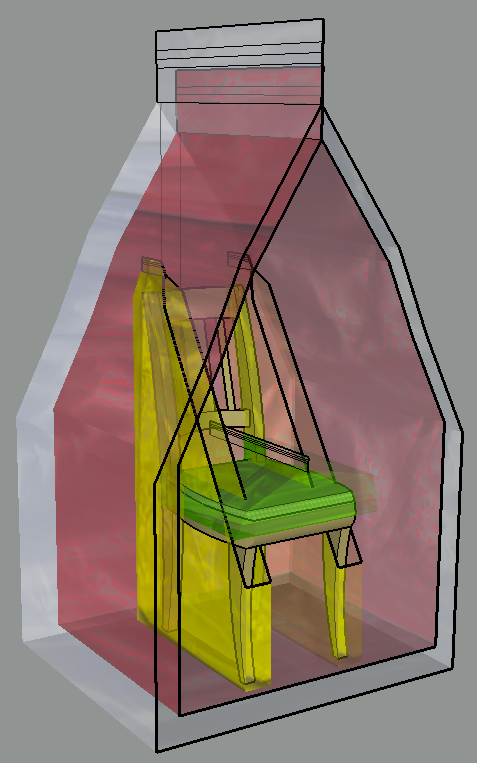
There is a particular issue with many CAD generated models. These models created in CAD systems use hierarchical levels, called families or bodies, that are linked to each other, allowing the design process to be parametric for parts that rely on other parts for size and location in space. When imported, however, each of these levels becomes a group or component within SketchUp. Some of these levels that were used for parametric linking, come across as empty groups and components. That is, they contained information but not geometry. But to SketchUp, these outer wrappers are unnecessary and come in as empty levels, simply containing the next level down, without any geometry at the current level. These are referred to as “empty wrappers”.
In this illustration the outer white wrapper is not needed. Imagine if multiple subcomponents in a file each had empty outer wrappers, this adds unnecessary complexity to the model. If you are working from an imported CAD file, you should check whether you need to simplify the CAD input by simplifying nesting levels or, preferably to remodel over the CAD geometry. It is best practice to eliminate empty wrappers (empty component levels).
The SketchUp Outliner is a great tool for restructuring a model quickly. The Outliner and the drawing window are linked, such that activity in one is expressed in the other. That is, selecting a component name in the model drawing window selects that very same component in the Outliner. Double-clicking on a component or group in the Outliner opens that very same component or group in the drawing window for editing.
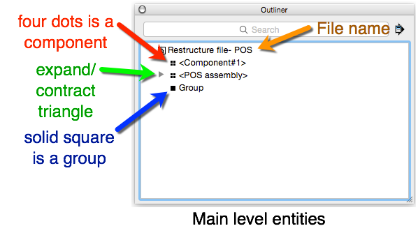
The Outliner shows the name of groups and components at each level of the model. Components are represented by four tightly packed squares. Components are listed by their definition name or an instance name. Groups are represented by a single solid square, and are listed as ‘Group’ by default, or by their name if one has been given.
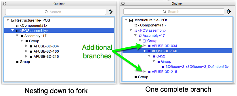
The Outliner may be expanded for any or all components and groups. When you expand a component or group using the drop down triangle, the nesting levels within that item are revealed. Since groups and components may be nested in any arrangement, the branching within CAD input can be very complicated and not seem logical for the SketchUp world. For this reason, we recommend that you restructure the main component and flatten the nesting of subcomponents to the minimum number that makes sense.
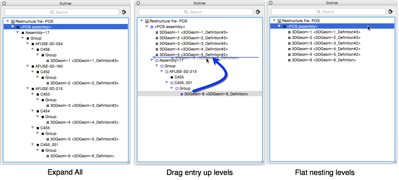
Dragging a group or component up the levels in the Outliner to just under the main component heading quickly restructures the sub-components inside a component. If this leaves the level (from which you moved the component) empty, the empty wrapper level is discarded.
An alternative method is to open the main group or component, and Explode the nested contents. Each Explode operation moves the contents up one level.
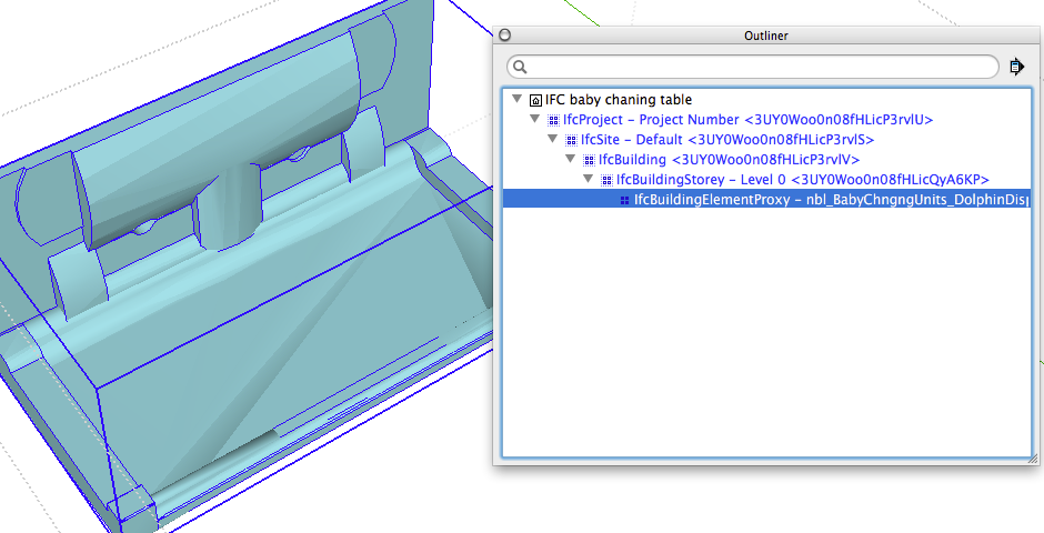
Many models coming from IFC files exhibit similar empty wrapper structure, based upon the IFC information levels. Sketchup content doesn't need to know what Project, Site, Building, nor Storey this baby changing table is within. The content should just be a changing table.
Lastly, it is best practice to give your components and sub-components meaningful names. This enables a user of your content to more quickly understand how to manipulate the color and orientation of parts within your product models.
Purge unused layers, components, and materials
Many SketchUp models have unused components in them. When you delete them, their definition still remains in your model, in case you want to use them later. If they are never used, SketchUp still keeps unused subcomponents, layers, and materials within the model. This is true for any component that is no longer used in a model.
This causes inefficiency in a model unless dealt with. Unused layers and subcomponents add unnecessary complexity to a model. Unused materials add to the component’s file size, affecting upload and download speeds, and can balloon a designer’s overall model file size when repeated across a design. This can discourage a user from using a product model altogether.
These issues can be easily solved in one step. Use Window > Model Info > Statistics and select Purge Unused. This recursively Purges unreferenced components, layers, styles, and materials from the model, all in one operation.
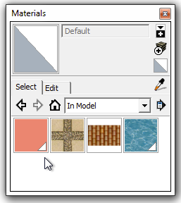
You can delete components and materials individually, directly from their browsers. Just remember, if you purge a component, it is deleted from the model, but it does not take any of its materials and layers with it. It also does not remove any of its subcomponents with it. When these subcomponents are purged, they leave behind their materials and layers as well. So the order of operations should be, to purge components and subcomponents, then layers, then purge materials. Any materials that are referenced in the model are shown with a white triangle on the color swatch in the Materials Browser on Windows.
To individually remove a component:
- Open the Component Browser. Window > Components
- Click on the In Model button (the House icon)
- Right click on a thumbnail, and select Delete
- Click OK, and the component is deleted from the model.
- Repeat process for any subcomponents that were left behind.
To individually remove a layer:
- Open the Layers Dialog. Window > Layers
- Click on the layer name to be deleted.
- Click on the minus button.
- If anything exists on that layer, SketchUp will ask how it should deal with the geometry. Select the radio button for either Move contents to the Default layer, Move contents to the current layer, or Delete contents.
- Usually you will want to select Move contents to the Default layer.
- The Layer is deleted from the model.
To individually remove a material:
- Open the Material Browser. Window > Materials
- Click on the In Model button (the House icon)
- Right click on a swatch, and select Delete… And SketchUp will offer to replace it with the default material. If you click OK, the material is deleted from the model.
- [Color Picker (Materials) Mac]
- Open the Color Picker. Window > Materials
- Click on the Brick icon in the top bar.
- Click on the In Model button (the House icon)
- Right click on a swatch, and select Remove… And SketchUp will offer to replace it with the default material. If you click Replace, the material is deleted from the model.
- Alternatively, go to the Color drop-down at the bottom of the Color Picker and select Remove
There is a particular issue with dynamic components that assign colors. Only one color can be used by any part at any time. But with Purge all, you run the risk of losing unreferenced materials. There are two quick solutions to this.
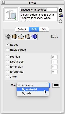
The first, and easiest method, is to paint the colors used by your dynamic component onto edges within the component geometry. As long as these edges are not deleted from the component, the color remains referenced, and hence not purgeable. To accomplish this, go to Styles > Edit > Edges and select By material from the color drop down. Now when you paint a material onto an edge, you will see the color on that edge. Remember to set edges back to All same before you upload the model. Even when the edges are set to All same, the colors remain. A corollary to this method is to build a color swatches component and paint your colors onto the faces of that component. Then include that component in the main component and Hide it. As long as the swatches component remains in the definition, the colors will not be purged.
The second method is to hard code the color RGB number values directly within the Dynamic Component Attributes. This method has the added benefit that even if the color gets manually removed from the model, when that color option is selected, the dynamic component will rebuild the color and add it to the model.
Use one layer: Layer0 (or minimal layers)
Delete all layers other than the default layer, Layer0, in the file to be uploaded.
By using Layer0, you help facilitate end users placing your content within their layering scheme. Designers develop layering systems within their design models, often times organically (on the fly). Scenes are heavily dependent upon layer visibility states. Extended animations and complex construction document sets are carefully integrated and built upon the designer’s layering. It causes designers unnecessary headaches when a large set of scenes get derailed by new (random) layers coming into the model from 3D Warehouse content.
To delete a layer, go to Window > Layers and select the layer name. Click on the minus button to delete the layer. When you delete a layer, you can choose to send the geometry to another layer or delete the geometry along with the layer. Make sure you select Move to Default Layer. This will ensure that your model has everything on Layer0. You can select multiple layer names, and delete them all in one operation.
Your component and group naming should govern the organization of your model in SketchUp (see the previous section on Restructuring for 3D Warehouse content). Layers are simply ‘light switches’ to show or unshow a particular aspect of the file. Do not confuse this with hiding entities. Layers in SketchUp set to non-visible are not hiding anything, they are just turned off.
You can model with layers in your working model to develop your components just delete them prior to upload to 3D Warehouse.
Use a simple consistent style
Delete all but one style in the file to be uploaded to 3D Warehouse.
Importing components brings only geometry and materials into the current SketchUp model. Anything in a style, including background images and watermarks, simply makes the upload file size bigger, making the 3D Warehouse upload and download process longer. Styles, scenes, background images, and empty layers all get removed during import into another model.
Branding should be done using 3D Warehouse tools, not by adding logos to the background or watermarks. Also, do not use raster image objects for your thumbnail view. This leaves a raster image object in the product model after it is placed, and the user has to edit the component to delete the image.
If you are building a series of components for a product line, you should consider standardizing the thumbnail viewing angle, edge style, and colors by using a ‘template file’, and uploading components from that template file.
Avoid stray geometry
Delete all floating and stray geometry from the upload file.
To do this, turn on all layers (hopefully you only have one!) and select View > Hidden Geometry. Then Zoom Extents and visually check your model for stray entities that are not needed by the model, and Delete them.
You may have hidden surfaces, edges, or groups while developing your component. These entities will affect the extents of the bounding box for the component.
Remodel (or delete) entities internal to the model that will not be seen (Revisit item 04 Minimum geometry above if needed).
Avoid section planes

Delete all section planes from the upload file, including section planes in nested components. Go to View > Section Planes or use the View section planes button to show the section planes in the model, and delete them.
Turn on Hidden geometry (View > Hidden geometry) to check for hidden section planes and delete them also.
Avoid guides
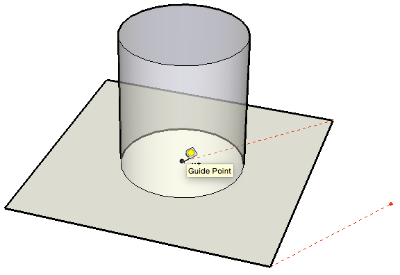
Delete all guides from the upload file. Use Edit > Delete Guides.
Guidelines clutter up the component and can make a model look like a porcupine when multiple components are placed around a design.
Use only appropriate text and dimensions
Delete all text and dimensions from your upload component, unless it is required for product placement information.
Text is dynamic in SketchUp. It orients with the model as the designer orbits the model. Text size is determined during design, with an eye toward final presentation. If the user did not place the text, chances are that your text will not be useful to them. Text and dimensions within components creates extra work to delete them prior to use.
- Use Window > Model Info > Text > Select All Leader Text then Edit > Delete to delete leader text.
- Use Window > Model Info > Text > Select All Screen Text then Edit > Delete to delete screen text.
- Use Window > Model Info > Dimensions > Select All Dimensions then Edit > Delete to delete all dimensions.
Keep in mind that the above steps work only within the current context. So if you have text or dimensions inside of subcomponents, you need to edit into those components to delete any text and dimensions.
Choose only appropriate geolocation
SketchUp files can be placed relative to real world coordinates using the Geolocation feature. This is great for buildings or parks or cities, but it is not necessary for product models. Clear any geo-location in your content file unless there is a need for it (for example, an historic building).
Use File > Geolocation > Clear Location.
If you need to geographically locate your component use File > Geolocation > Add Location.
Test for correct behavior
Save your file with the model in the screen orientation you want for its thumbnail. Now your model is ready to be tested for behavior.
Open a new file or a template file you have developed for this purpose. In the Component Browser navigate to your file(s).
- Does the thumbnail look correct?
- Import the component. If it is a gluing component, make sure that it applies to faces properly.
- If it is a free standing component, make sure that it inserts by the desired point.
- Select the component. Is the bounding box tight to the geometry?
- Make sure the component spins as expected with the Move tool.
- Test painting the component. Does it receive color as you desire?
- Does the component edit with minimal clicks as you expect?
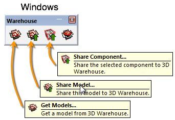
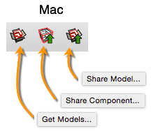
If you are satisfied with the behavior, your component is ready for upload. Use the Warehouse toolbar,
on Windows: View > Toolbars... > Warehouse
on the Mac: View > Tool Palettes > Warehouse
Or you can upload it from this behavior test file. Orient your view to how you would like the thumbnail to look (or click on a standard thumbnail scene if there is one in the file). On the component, Right-click [context click] > Share Component… , or use the share component button on the 3D Warehouse toolbar.
Congratulations! You are finished.
